
Raji Adeoye
Ibadan, Nigeria
Currently at
GoatFunded
FundingTrader
Redesigning Funding Trader's Website for more Trust and Conversions
I redesigned their full marketing site from the ground up, turning a dated dark-themed layout into a sharp, conversion-focused prop trading experience.
Funding Traders — Website Redesign
A visual overhaul of a prop trading firm's marketing site, transforming a functional but dated layout into a high-trust, conversion-focused fintech experience.
Project type: Web Redesign
Industry: Fintech / Prop Trading
Role: Web Designer
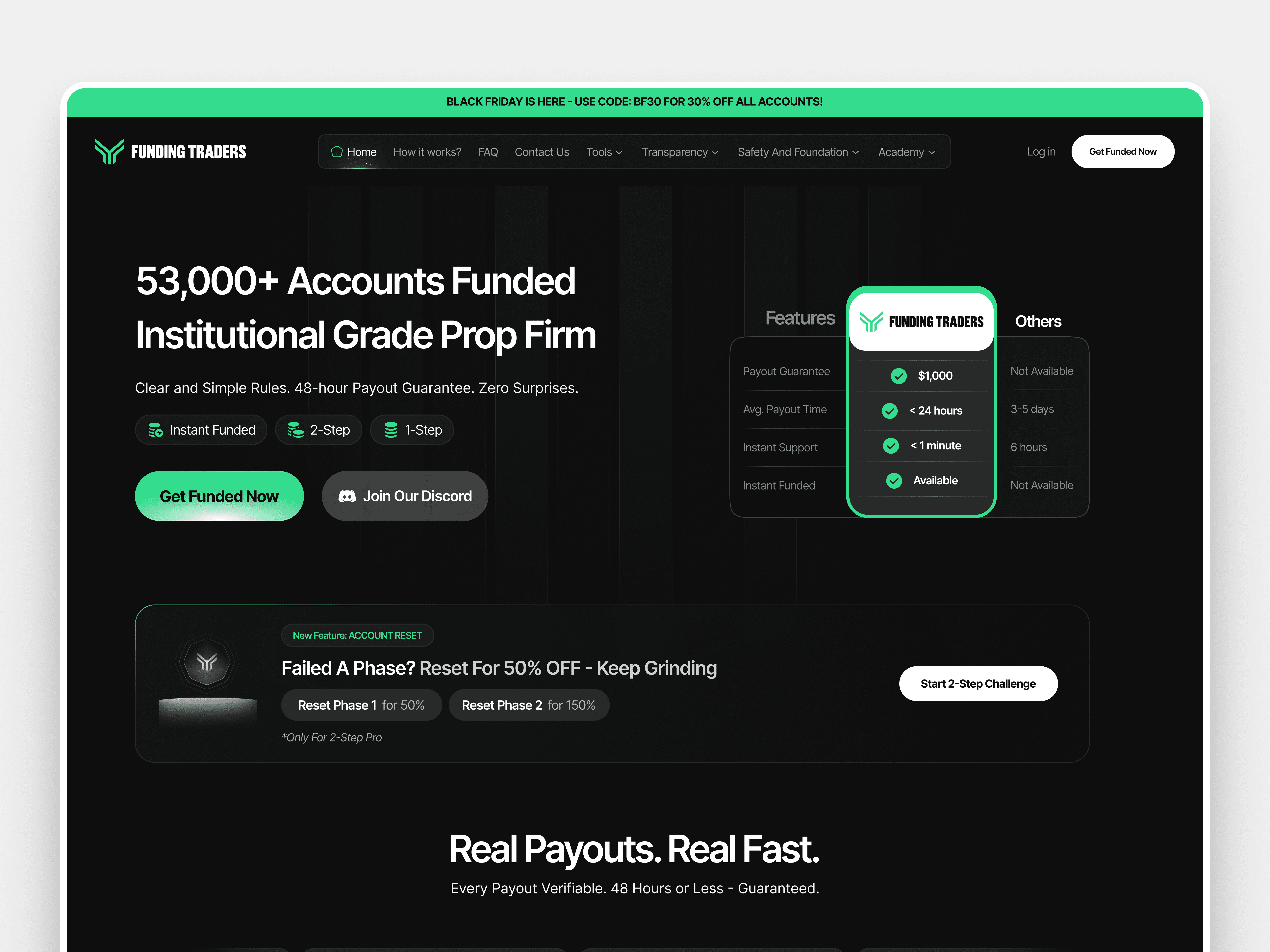
A Platform With Strong Credibility, Held Back by Its Own Website
Funding Traders had built something real. Over 53,000 funded accounts, verified payouts, and a growing community of serious traders. The product had earned its credibility. The website had not.
The original site leaned on conventions that had aged out of the market: generic card layouts, predictable green-on-dark color usage, and typographic hierarchy that scattered attention instead of directing it. For a platform where users are making financial decisions, that disconnect between product quality and visual presentation creates friction before anyone even reads a word of copy. The site needed to look like what it already was.
How the Work Was Structured
The process ran in four phases, each feeding into the next.
The first phase was a full visual audit. Every section of the existing site was reviewed with one question in mind: is this doing conversion work, or is it creating noise? The audit surfaced a clear pattern. Weak typographic hierarchy meant trust signals were buried. Low-contrast CTAs were easy to overlook. Social proof sections existed but weren't landing because the design gave them no visual authority.
The second phase was direction setting. The design direction landed on a dark base with a disciplined, accent-only use of the brand green. The reference point wasn't other prop firm sites. It was closer to Bloomberg Terminal or a premium SaaS dashboard: dense, purposeful, built for people who take their craft seriously.
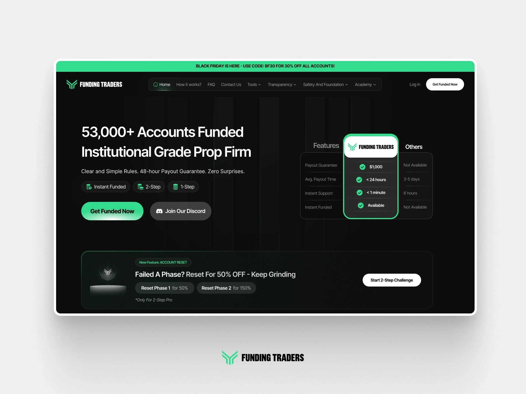
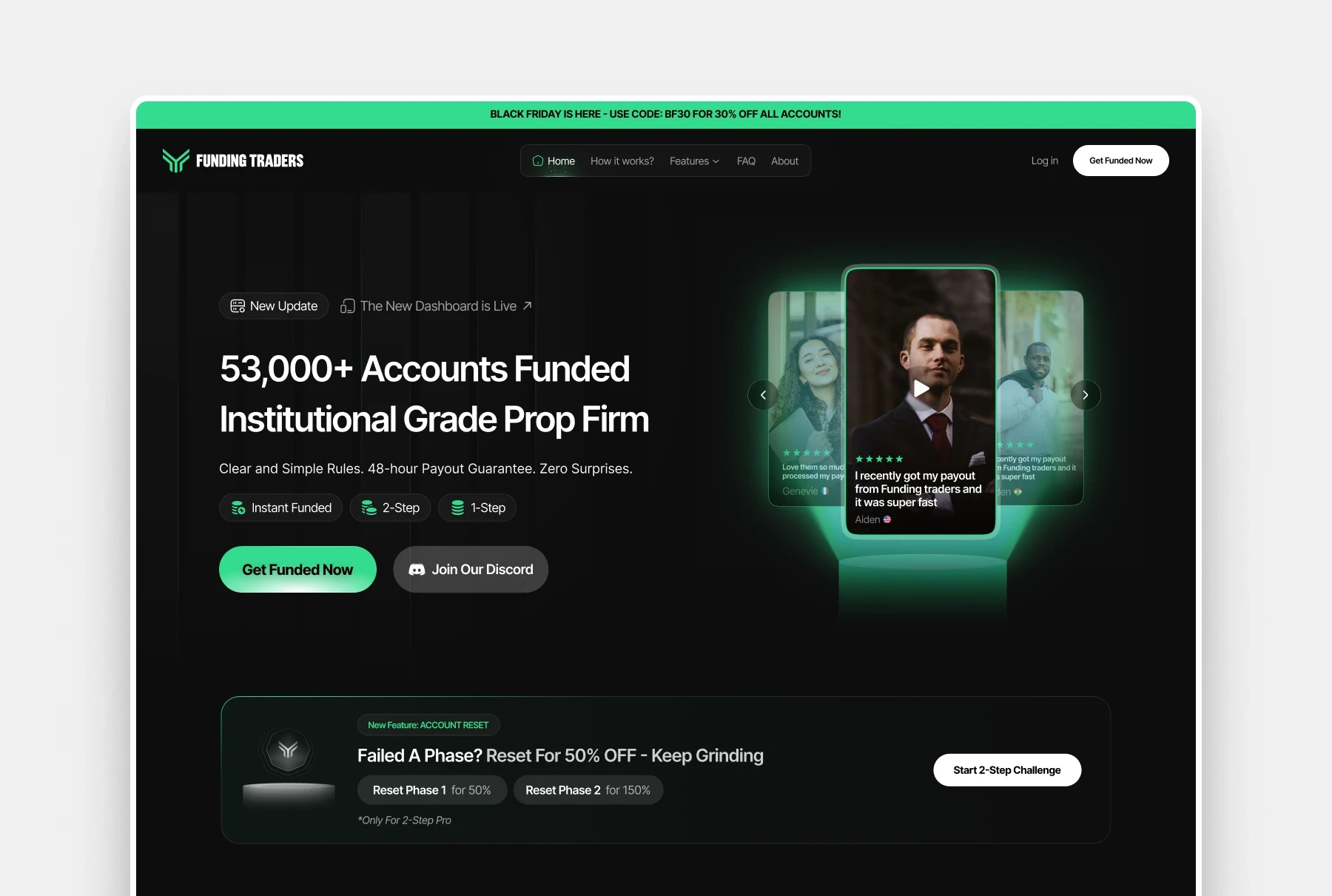
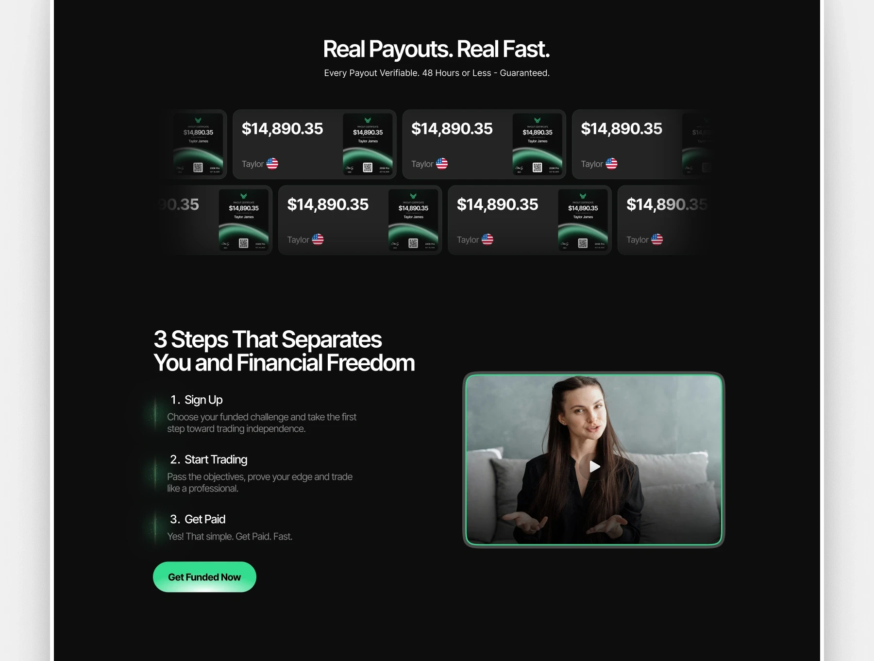
The third phase was component redesign. Every major section was rebuilt from scratch. The hero, the payout ticker, the challenge pricing table, the social proof cards, the platform logo strip, and the FAQ section were all redesigned with consistent spacing, a tighter typographic scale, and clear visual hierarchy throughout.
The fourth phase was full-page composition. All redesigned sections were assembled in Figma into a single cohesive layout, with attention paid to the rhythm between sections, the consistent application of the green accent, and the path a first-time visitor would take from scroll to CTA click.
The Decisions That Shaped the Design
Green appears everywhere on prop firm sites. Here, it was pulled back to accent-only use: buttons, highlighted stats, and key data points. Restraint is what gives it weight. When green only appears on the things that matter, the eye follows it.
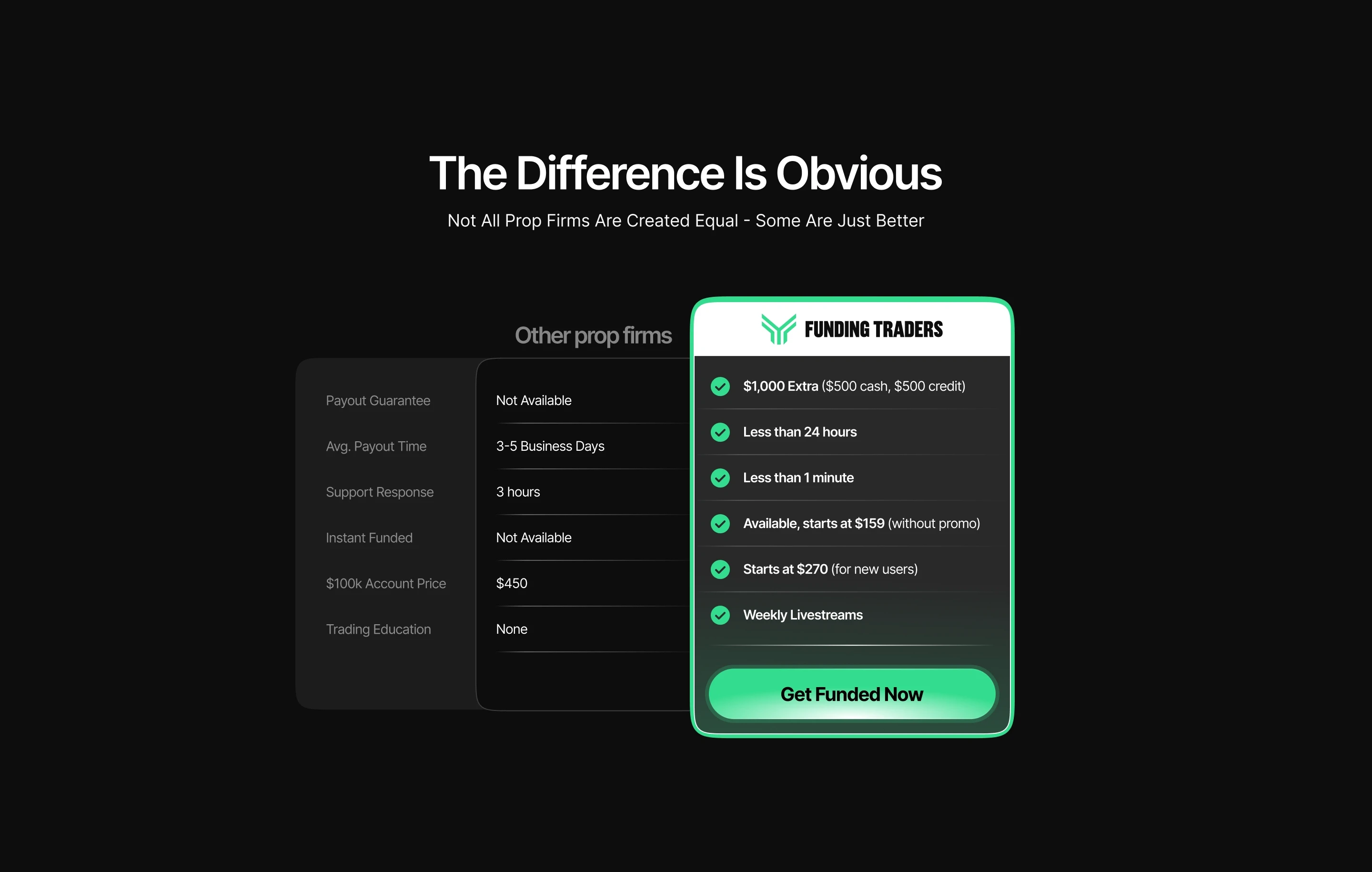
Typography was tightened across the board. Heading sizes, body text, and label styles were brought into a proper scale. Payout amounts, account counts, and platform stats were given dominant sizing because those numbers are what convert a skeptical visitor into a buyer. If you are trying to decide whether to trust a platform with real money, seeing "53,000+ funded traders" at a size that registers is meaningful.
The payout certificates and testimonials section was rebuilt as a scannable card system. The goal was to make the volume and consistency of payouts legible at a glance rather than requiring anyone to slow down and read.
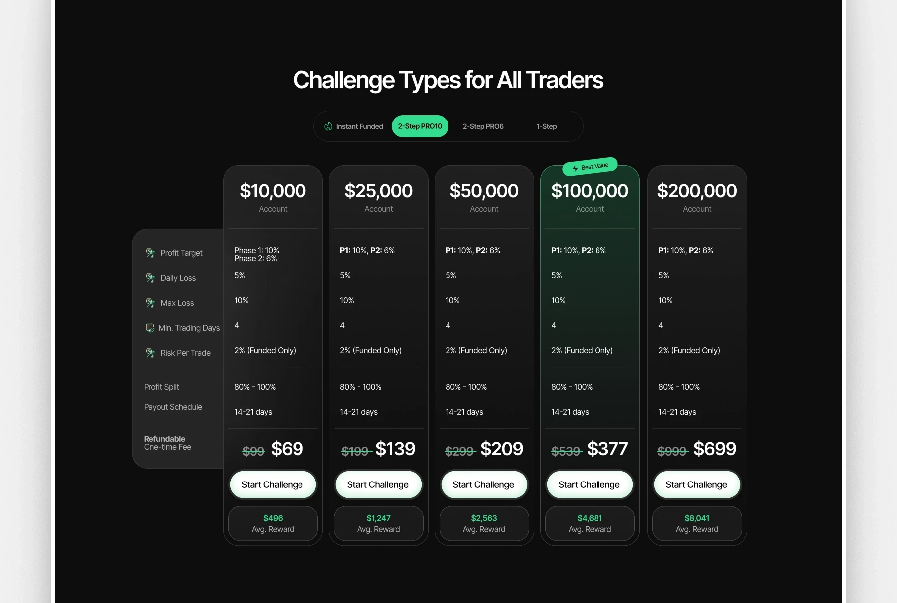
The pricing and challenge table was the most structurally demanding section. It was rebuilt with clear visual grouping, readable rule breakdowns per tier, and a prominent CTA attached to each option. The original layout created decision friction by presenting options without clear visual anchors. The redesign reduces that friction by making each tier feel like a self-contained unit.
What the Redesign Delivers
A visual identity that matches the platform's actual credibility. A site that earns attention before it asks for a decision. A clearer conversion path from the hero through to CTA, with trust signals placed before the ask rather than after. A scalable Figma component structure that makes future updates fast and consistent rather than a rework each time.
The brand now has a dark-mode-first design language it can carry forward across new pages, campaigns, and product updates without starting from scratch.
The full site is live at fundingtraders.com.
View Next Project

Taking booking for Q3 2026 .
Let's think carefully, move deliberately, and build something distinctive.

SEND AN EMAIL
rajiadeoye410@gmail.com
DRIBBLE
CONTRA
BEHANCE
behance.net/rajiadeoye
Copyright 2026 Raji Adeoye. All Rights Reserved